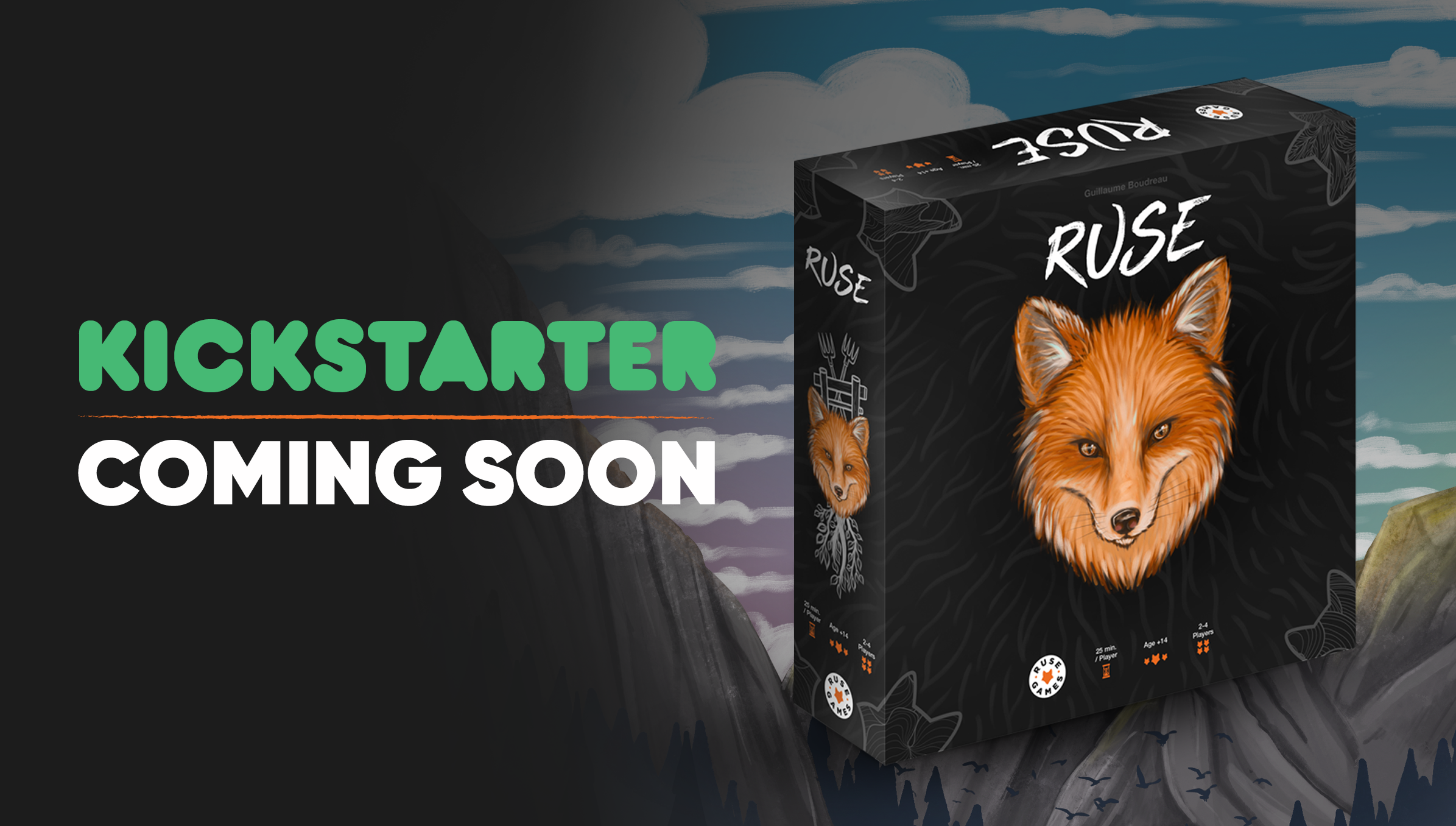
Many of you participated in the survey for the colour of the box, using the form on the website, on Instagram, in comments on Facebook and interest groups! I even received a few relevant private messages about it…
A big thank you for your participation; you are all wonderful.
We finally have a winning colour, a pretty straightforward victory.
Here are the results:
White
Web survey 42
Facebook 16
Facebook Groups 33
Total: 91
Black
Web survey 73
facebook 60
Facebook Groups 43
Total: 176
The black box victory is quite convincing, especially if I add the feedback received outside of the virtual world.
Some examples of comments:
– Le renard resort davantage sur le fond noir
– Black looks more classy and grabs the attention
– C’est trop beau! 🦊j
– Foxes are nocturnal, you can see the entire content with black as the background, AND black will look clean longer. Tokaido taught me that.
– Le nom du jeu ressort mieux sur le fond noir.
– Better contrast 👍 (Black)
Questions answers:
You also sent me some questions; here are the answers.
Q. Have you tried the orange fox on green?
A. Yes, and the contrast between the 2 colours was really too intense for the eyes.
Q. If there is an extension, could you use the white box?
A. The main game box will be black, the rulebook cover will be white, and the expansion cover will probably be white. We are thinking of creating a junior version which will be pale gray and another version of the game with an orange cover! More details to come about the last one during the campaign. 😉

That’s it, the colour of the box is now determined, so I’m now going to finalize the design!
Thanks again for your participation!
